Does anyone like the new "All apps" pane on the Start Menu? What would you prefer?

    First of all, since I will be picturing several Start Menus below, I would like to be clear that we are not discussing the Start Menu or Metro Tiles, but only the All apps pane in Windows 10, the All apps screen in Windows 8, the All Programs pane in Windows 7, and the Programs menu of the Windows XP/Vista Classic Start Menu.

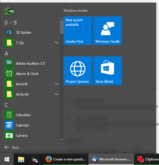
    I personally find the new All apps pane on the Windows 10 Start Menu to be very clumsy and restrictive, and was wondering if anyone else actually likes it.  Here it is, pictured below (see the left side):

Image

Figure 1: Windows 10 All apps pane

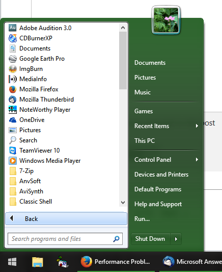
    Windows 10's All apps pane is reminiscent of the one Windows 7 has, which I don't like either.  However, compared to Windows 7, Windows 10 has a greatly restricted view (showing only 9 programs in the screenshot above!), and its context menu is completely stripped of functionality.  So it's basically worse than what we had in Windows 7 (which is showing 18 programs in a similar amount of space below):

Image

Figure 2: Windows 7 All Programs pane (simulated by Classic Shell)

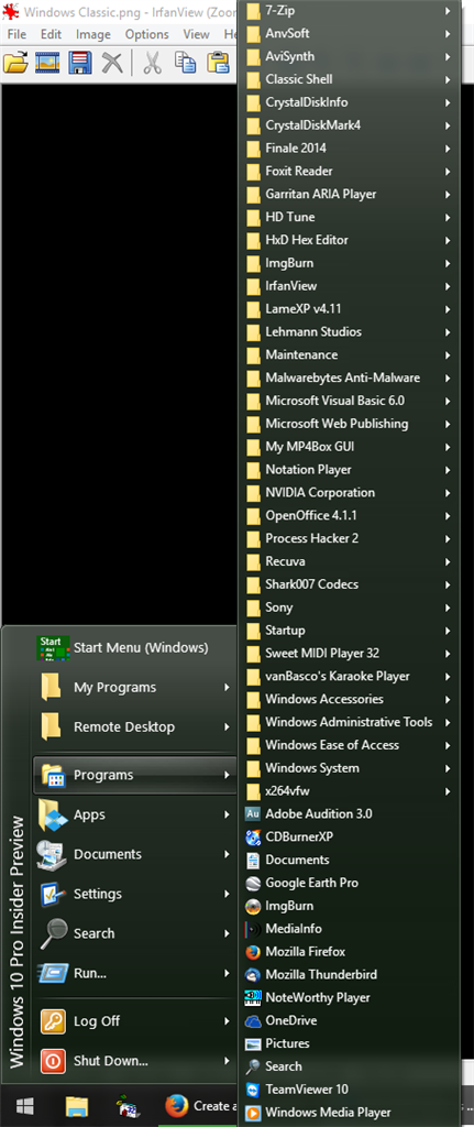
    On a desktop computer, I greatly prefer the Windows XP/Vista classic menus.  They are very easy and fast to navigate, you can see a whole lot more programs at a time (which aids in instead visual recognition), and you can open any program with just two clicks.  In fact, at this time, all of my programs fit on the screen without requiring any scrolling (see the right side below):

Image

Figure 3: Classic Programs menu from XP/Vista, simulated by Classic Shell

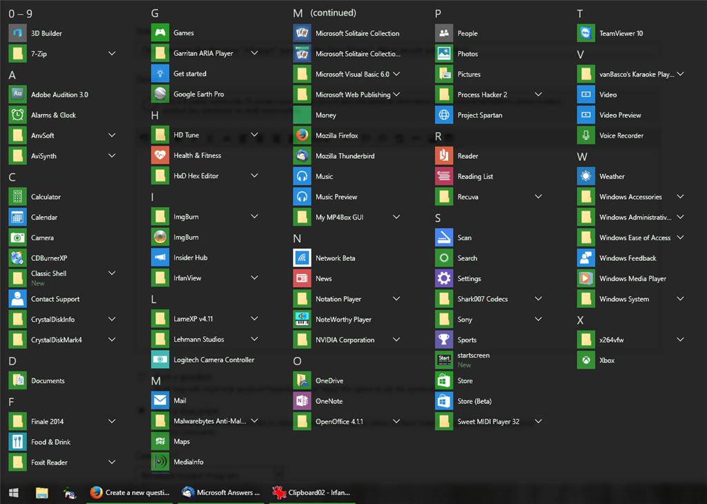
    Now, none of the above are tablet friendly, including the current Windows 10 implementation.  Having used Windows 7, Windows 8, and Windows 10 on a tablet, I must say that the All apps screen in Windows 8, while poorly arranged, is very convenient to navigate on a tablet (and actually not that bad on a touch-enabled laptop).  Unfortunately, with Windows 10, touchscreen users are still stuck with the tiny, clumsy, and vertical scrolling All apps pane shown in my first screenshot.  I think something like the image below would be nicer for touchscreen users; it incorporates the touchscreen friendliness of Windows 8's All apps screen, while retaining the better organization of the Windows 10 All apps pane:

Image

Figure 4: My All apps screen concept (the folders should probably all be expanded, but that would have taken a lot of time for me to put together)

Was this discussion helpful?

Sorry this didn't help.

Great! Thanks for your feedback.

How satisfied are you with this discussion?

Thanks for your feedback, it helps us improve the site.

How satisfied are you with this discussion?

Thanks for your feedback.

* Please try a lower page number.

* Please enter only numbers.

* Please try a lower page number.

* Please enter only numbers.

    So to sum up, here is what I think would be good the "All apps" functionality:

  • Totally remove the existing All apps pane.
  • Write two implementations for All apps: A cascading All apps menu (similar to Figure 3), and a horizontal scrolling All apps screen (similar to Figure 4).  This should not require a ton of coding since:
    1. The cascading menu code already exists in Windows 10 as can be seen when adding a folder toolbar to the taskbar.  This code would provide the functionality for the mouse-friendly cascading All apps menu.
    2. The existing App apps panel code just needs to be tweaked to support horizontal scrolling and multiple columns to provide the new, touch-friendly All apps screen.
  • Do one of the following for customization:
    • Add a tri-state option to Settings -> Personalization -> Start: Automatic (based on tablet mode), Always use the menu, Always use the screen.
    • Or, make the "All apps" button on the Start Menu like the buttons in the "Most used" section, which have a ">" tab to open the sub-menu.  Clicking "All apps" would open the screen.  Hovering over "All apps" or clicking the ">" would open the menu.Image

    If you don't like the All apps pane as it is now, and you would prefer the changes suggested above (even if there are some minor/other adjustments you would like to make), please Like this post.  Otherwise, I'd love to see the reasons why you prefer the existing All apps pane as it is now.
Dear Microsoft, please make Windows 10 functional, pretty & intuitive, not boring, clumsy & buggy!

Was this reply helpful?

Sorry this didn't help.

Great! Thanks for your feedback.

How satisfied are you with this reply?

Thanks for your feedback, it helps us improve the site.

How satisfied are you with this reply?

Thanks for your feedback.

What makes you think MS listens to Insiders?  They couldn't care less about what we think of the interface.

Was this reply helpful?

Sorry this didn't help.

Great! Thanks for your feedback.

How satisfied are you with this reply?

Thanks for your feedback, it helps us improve the site.

How satisfied are you with this reply?

Thanks for your feedback.

I still prefer the Windows 8 click one and boom all the apps show up ...no hidden programs to have to search thru constantly irritating in Win 10...same goes for the Win 8 Start screen...I've arranged all my favorite apps and programs on one whole page as much as possible...no fuss no searching...and it's just as easy using a mouse...in Windows 10 trying to pin an app/tile to start is like a mouse game with the screen shifting all over...I d know ...is it any better in build 058?

XP would be my second choice.*john

mine...I'm out-of date.

Was this reply helpful?

Sorry this didn't help.

Great! Thanks for your feedback.

How satisfied are you with this reply?

Thanks for your feedback, it helps us improve the site.

How satisfied are you with this reply?

Thanks for your feedback.

and don't forget how *PIG* *SLOW* the 'all apps' is, even when there are only the 50 pre-loaded ones.

let's get HONEST in alt.comp.os.windows-10 on USENET, where there are NO mods

Was this reply helpful?

Sorry this didn't help.

Great! Thanks for your feedback.

How satisfied are you with this reply?

Thanks for your feedback, it helps us improve the site.

How satisfied are you with this reply?

Thanks for your feedback.

I think it is ok   no problem to navigate and most of my everyday apps are on the task r start menu.  The old  ALL APPS design were faster to find but no case for touch screen.   I cant see any big deal with complaining about this item

Was this reply helpful?

Sorry this didn't help.

Great! Thanks for your feedback.

How satisfied are you with this reply?

Thanks for your feedback, it helps us improve the site.

How satisfied are you with this reply?

Thanks for your feedback.

I'm all for your idea, if we can get MS to listen. We need choice, not a bizarre patchwork fusion of Menu and Screen elements that doesn't work for the fans of either UI.

I especially like that you acknowledge that the Screen/8.1 All Apps work for some. As long as I could have that on the my desktop and not the cascading version, I'd be able to live with 10.

"Love is just a trick nature plays on us to get us to reproduce" - Callisto, Xena Warrior Princess

Was this reply helpful?

Sorry this didn't help.

Great! Thanks for your feedback.

How satisfied are you with this reply?

Thanks for your feedback, it helps us improve the site.

How satisfied are you with this reply?

Thanks for your feedback.

Alphabetica list is horrible.

it's bad for my carpel tunnel to have to scroll that much.

How to uninstall onedrive?  When I right click and choose 'uninstall' it takes me to control panel / remove program... but which feature/function do I turn off?

Was this reply helpful?

Sorry this didn't help.

Great! Thanks for your feedback.

How satisfied are you with this reply?

Thanks for your feedback, it helps us improve the site.

How satisfied are you with this reply?

Thanks for your feedback.

I don't have a problem with Alphabetical, but it shouldn't be the only sort option I agree. 8 had multiple ways to sort in the Screen's All Apps, which was one of its strengths I thought. That should be brought to Frankenmenu.
"Love is just a trick nature plays on us to get us to reproduce" - Callisto, Xena Warrior Princess

Was this reply helpful?

Sorry this didn't help.

Great! Thanks for your feedback.

How satisfied are you with this reply?

Thanks for your feedback, it helps us improve the site.

How satisfied are you with this reply?

Thanks for your feedback.

I want the customizability of XP start menu, plus the pretty stuff from WIn7 - most recent/document most used programs.

That's a perfect compromize - for a XP/7 guy.

You win8 start screen guys, well, dunno what to say about that - I got an android phone full of widgets for that.

Was this reply helpful?

Sorry this didn't help.

Great! Thanks for your feedback.

How satisfied are you with this reply?

Thanks for your feedback, it helps us improve the site.

How satisfied are you with this reply?

Thanks for your feedback.

Seems the only way to fix the Start menu in Windows 10 is this:

Image

Classic Shell XP style..   I prefer the dark menu rather than white. *john

mine...I'm out-of date.

Was this reply helpful?

Sorry this didn't help.

Great! Thanks for your feedback.

How satisfied are you with this reply?

Thanks for your feedback, it helps us improve the site.

How satisfied are you with this reply?

Thanks for your feedback.

* Please try a lower page number.

* Please enter only numbers.

* Please try a lower page number.

* Please enter only numbers.


Discussion Info


Last updated April 12, 2025 Views 767 Applies to: