First of all, since I will be picturing several Start Menus below, I would like to be clear that we are not discussing the Start Menu or Metro Tiles, but only the All apps pane in Windows 10, the All apps screen in Windows 8, the All Programs pane in Windows 7, and the Programs menu of the Windows XP/Vista Classic Start Menu.
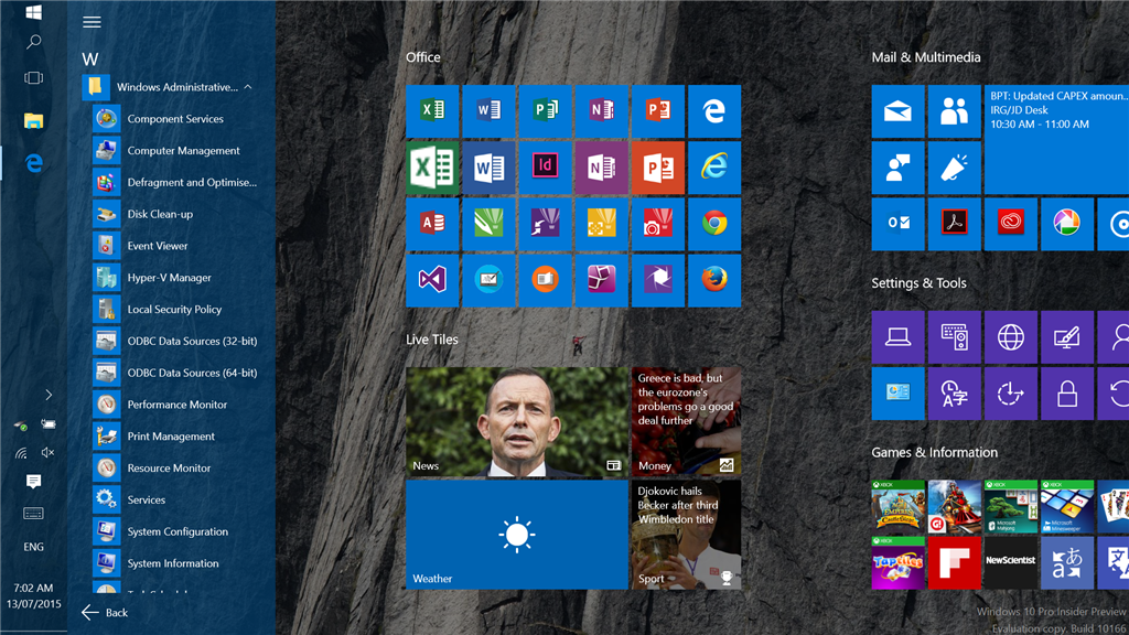
I personally find the new All apps pane on the Windows 10 Start Menu to be very clumsy and restrictive, and was wondering if anyone else actually likes it. Here it is, pictured below (see the left side):
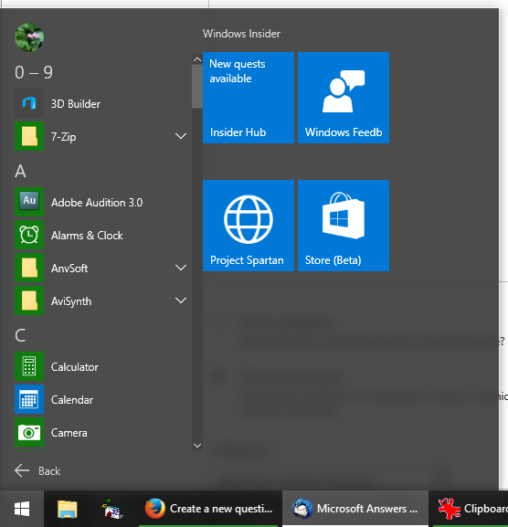
Figure 1: Windows 10 All apps pane
Windows 10's All apps pane is reminiscent of the one Windows 7 has, which I don't like either. However, compared to Windows 7, Windows 10 has a greatly restricted view (showing only 9 programs in the screenshot above!), and its context menu is completely stripped of functionality. So it's basically worse than what we had in Windows 7 (which is showing 18 programs in a similar amount of space below):
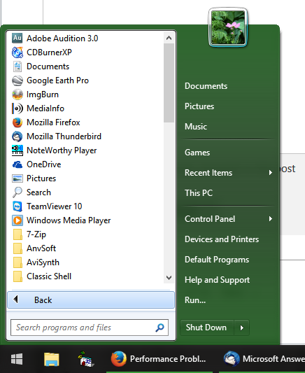
Figure 2: Windows 7 All Programs pane (simulated by Classic Shell)
On a desktop computer, I greatly prefer the Windows XP/Vista classic menus. They are very easy and fast to navigate, you can see a whole lot more programs at a time (which aids in instead visual recognition), and you can open any program with just two clicks. In fact, at this time, all of my programs fit on the screen without requiring any scrolling (see the right side below):
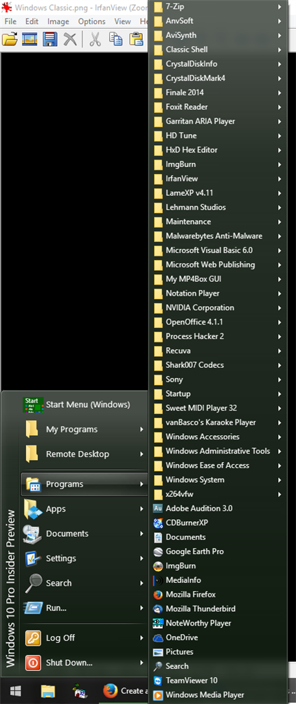
Figure 3: Classic Programs menu from XP/Vista, simulated by Classic Shell
Now, none of the above are tablet friendly, including the current Windows 10 implementation. Having used Windows 7, Windows 8, and Windows 10 on a tablet, I must say that the All apps screen in Windows 8, while poorly arranged, is very convenient to navigate on a tablet (and actually not that bad on a touch-enabled laptop). Unfortunately, with Windows 10, touchscreen users are still stuck with the tiny, clumsy, and vertical scrolling All apps pane shown in my first screenshot. I think something like the image below would be nicer for touchscreen users; it incorporates the touchscreen friendliness of Windows 8's All apps screen, while retaining the better organization of the Windows 10 All apps pane:
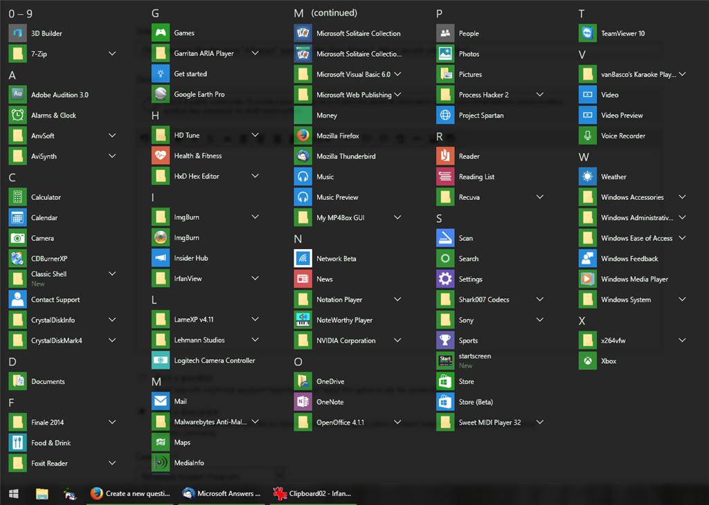
Figure 4: My All apps screen concept (the folders should probably all be expanded, but that would have taken a lot of time for me to put together)