Hello!
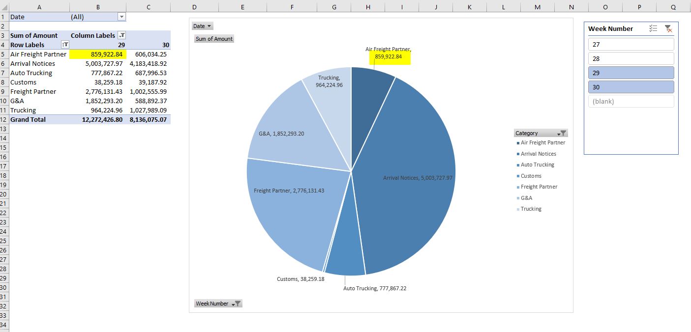
I'm trying to create a dynamic pie chart from a pivot table of data and included a slicer to filter by week number. I want to compare spend on a weekly basis (by week number) or between multiple weeks.
When trying to filter by week number, the data reflected in the data label is being pulled from the 1st column shown when filtered. How do I have the data label reflect the total sum of the columns instead of pulling from the 1st column of the pivot table?
For example, I want to see the total categorical spend of weeks 29 & 30, but the data label reflects the categorical spend of week 29.