Pivot Chart Axis issue

I have two pivot charts superimposed on each other in a Dashboard.

When a full year's data is being displayed, the charts look like I expect, displaying the full year in a suitable scale.

When I use a Slicer to get the current year (ie only Jan & Feb data)

Both X & Y axes are reformatted to make the resulting charts look very different, and totally distorting the visual effect.

Is there any way to force the Axes to maintain the same scale. There is a button next to the value field in Axis Options, but it appears to be locked, as I cannot move it away from Auto

Hope someone can help.

Hello Bonalymac, Thanks for contacting us. You can manually set the scale of the X and Y axes in your pivot charts to maintain the same scale, even when the data changes due to a slicer. Here's how: 1. Select one of the pivot charts in your Dashboard. 2. Click anywhere inside the chart to display the Chart Tools contextual tab in the ribbon. 3. Click on the "Design" tab in the ribbon, and then click the "Select Data" button in the Data group. 4. In the "Select Data Source" dialog box, click on the "Hidden and Empty Cells" button at the bottom left. 5. In the "Hidden and Empty Cells Settings" dialog box, click on the "Show" radio button next to "Empty cells as:". 6. Select "0" in the text box next to the "Empty cells as:" radio button. 7. Click "OK" to close both dialog boxes. 
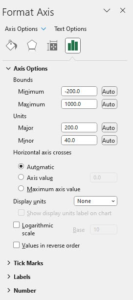
8. Right-click on the X-axis of the pivot chart and select "Format Axis" from the context menu. 9.In the "Format Axis" pane on the right side of the screen, click on the "Axis Options" icon (looks like a chart with an arrow) at the top. 
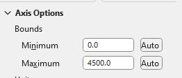
10. In the "Axis Options" section, click the "Fixed" radio button next to "Minimum" and "Maximum". 11. Enter the minimum and maximum values you want for the X-axis in the text boxes provided. 12. Repeat steps 8-11 for the Y-axis. 13. Repeat steps 1-12 for the other pivot chart in your Dashboard. 
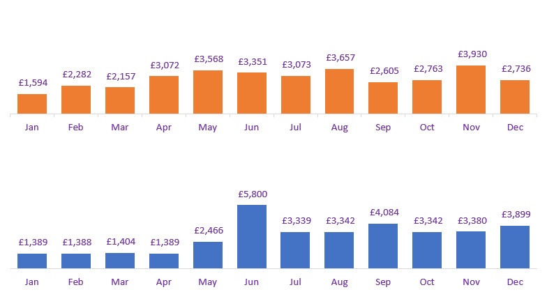
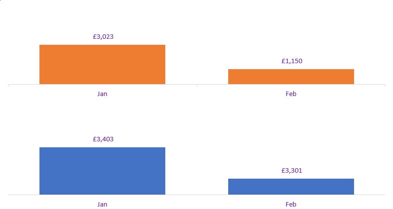
Now, even when the data changes due to a slicer, the X and Y axes will maintain the same scale, providing a consistent visual effect across your pivot charts. I hope this helps. Regards, Akande

Was this reply helpful?

Sorry this didn't help.

Great! Thanks for your feedback.

How satisfied are you with this reply?

Thanks for your feedback, it helps us improve the site.

How satisfied are you with this reply?

Thanks for your feedback.

Hi Akande

Thanks so much for your help and the really detailed instructions which I printed out and have tried to follow.

It's all worked fine until point 10. I'm not even seeing Min & Max options for the X-Axis (I'm guessing it is something to do with it being a "months" scale, rather than numeric).

If I try the Y-Axis which is a monetary amount then I do see them, but no radio button. Again I'm guessing, but does this relate to the auto button (not a radio button as you have) which you can see below, but which I cannot click.

Any thoughts on that issue?

Colin

Was this reply helpful?

Sorry this didn't help.

Great! Thanks for your feedback.

How satisfied are you with this reply?

Thanks for your feedback, it helps us improve the site.

How satisfied are you with this reply?

Thanks for your feedback.


Question Info


Last updated May 19, 2023 Views 304 Applies to: