My pie chart does not reflect the correct percentage (excel)

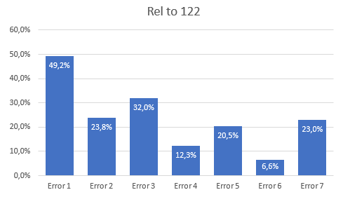
I made a pie chart for work showing paperwork errors for a total of 122 submitted papers.

Error 1 - 60

Error 2 - 29

Error 3 - 39

Error 4 - 15

Error 5 - 25

Error 6 - 8

Error 7 - 28

I want the graph to reflect each error's percentage of 122, not the total amount of errors. How do I fix this.

Thanks in advance!

Answer
Answer

You can use a pie chart, but you have to be careful with its interpretation.

If you set all values in relation to the value 122, then you get new percentage values for each category, and those combined will not add up to 100%. A pie chart shows (when % is chosen) sections whose total area is 100%, and each section's area is a relative portion of a category compared to the sum of all categories.

The two top charts show equal sizes for the segments in the pie, that's because the relative sizes are shown. But, that doesn't reflect the percentage values (bottom chart to the right). The bottom chart to the right is maybe misleading, but it is correct in the sense that all values are represented correctly compared to each other. But their relative sizes don't reflect their actual values, which pie charts never do, and here comes the confusion when you want to show percentage value, like 49% which relative to the other is about 30%.

Go with another chart type, like column chart.

7 people found this reply helpful

·

Was this reply helpful?

Sorry this didn't help.

Great! Thanks for your feedback.

How satisfied are you with this reply?

Thanks for your feedback, it helps us improve the site.

How satisfied are you with this reply?

Thanks for your feedback.


Question Info


Last updated February 6, 2025 Views 20,758 Applies to: