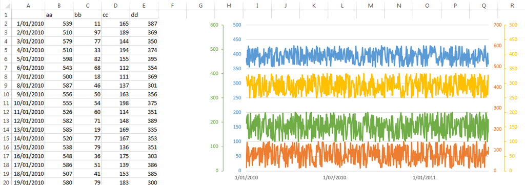
As far as I can tell Excel has a limit of 2 y axis, i.e. 2 vertical axis, when creating a chart. I would like to be able to create charts with more than 2, possible up to 8 vertical axis in order to provide comparisons on a single chart, rather than have multiple charts with just 2 datasets compared.
For example, I want to compare the price history of aluminum, copper, iron, and zinc all on one chart with a line for each metal in different colors, or possibly different combinations of dashes and dots for black and white printing.
Is there a way to do this in Excel?
If not I would like to suggest that feature be added.

