
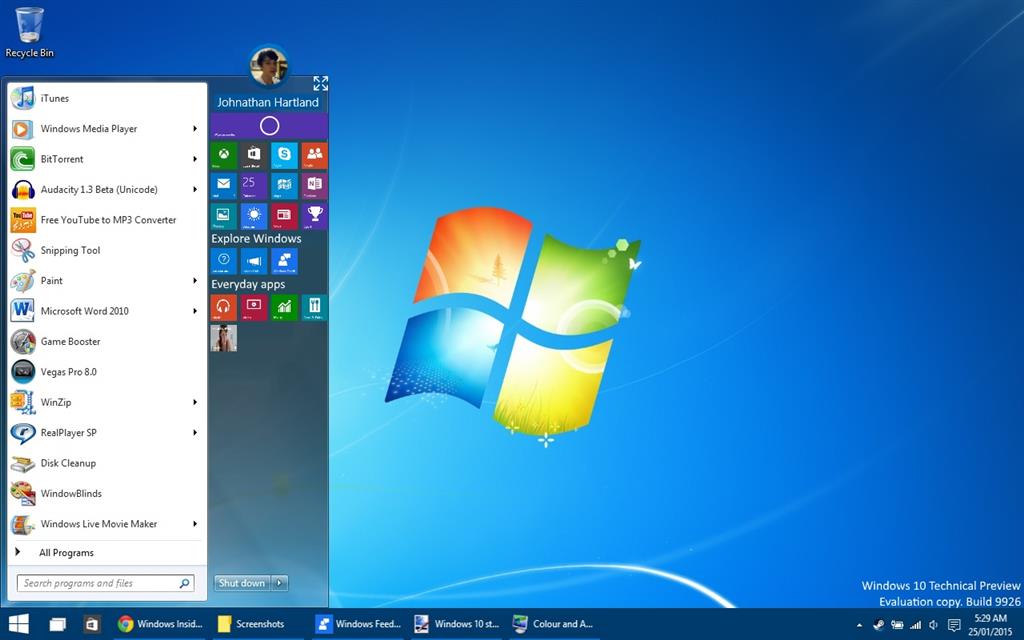
You could of course change the size of icons if you choose, but this time around it would be inside the Windows 7 start menu size, which looks much more appealing in my opinion and much more familiar to everyone who's fond of Windows 7. The search bar would now just be within the start menu and no longer on the task bar, which I kind of think looks a little strange.
You're now able to create folders in the 'all programs/all apps' part, just like Windows 7, the power button is nice and close to the start button, you can still expand start, and all is well.
I'd be much more comfortable with this design myself. What do you guys reckon?
