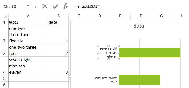
I'm working with Office 2013, which doesn't seem to allow the user to format axis labels in charts. The text box for each label is aligned to the axis, but within each text box the words are centered. I want everything to be justified against the axis (right justified).
Excel produces labels that look like this:
|--------------------------
blahdi |
blah | [data]
blaahh |
|--------------------------
|
nadi | [data]
nah |
|--------------------------
|
ta da | [data]
|
|--------------------------
When they should look like this:
|--------------------------
blahdi |
blah | [data]
blaahh |
|--------------------------
|
nadi | [data]
nah |
|--------------------------
|
ta da | [data]
|
|--------------------------
But I cannot find a way to make things look the way I want.
My workaround has been to abbreviate the labels so that they fit on one line whenever possible, but some labels just need a lot of long words.
So far none of my readers have cared about these formatting details, but surely the user should be able to adjust the formatting of labels in charts!!! Any advice on other workarounds would be welcome.